Quantifying and visualizing IoT data in buildings.
role & responsibilities --
UX designer Primary and secondary research, site-mapping, user flows, information architecture, low to hi-fidelity wireframing, prototyping, usability testing.
context--
june 2019 - present
context --
In June 2019, I joined IBM Watson’s Internet of Things (IoT) team to help re-invent the product architecture, features, and functionality for one of its key portfolio products: IBM TRIRIGA Building Insights. TRIRIGA Building Insights (TBI) is a platform that aggregates and visualizes IoT data in buildings to provide data-driven insights on utilization, occupancy, and energy throughout multiple levels of the building.
What
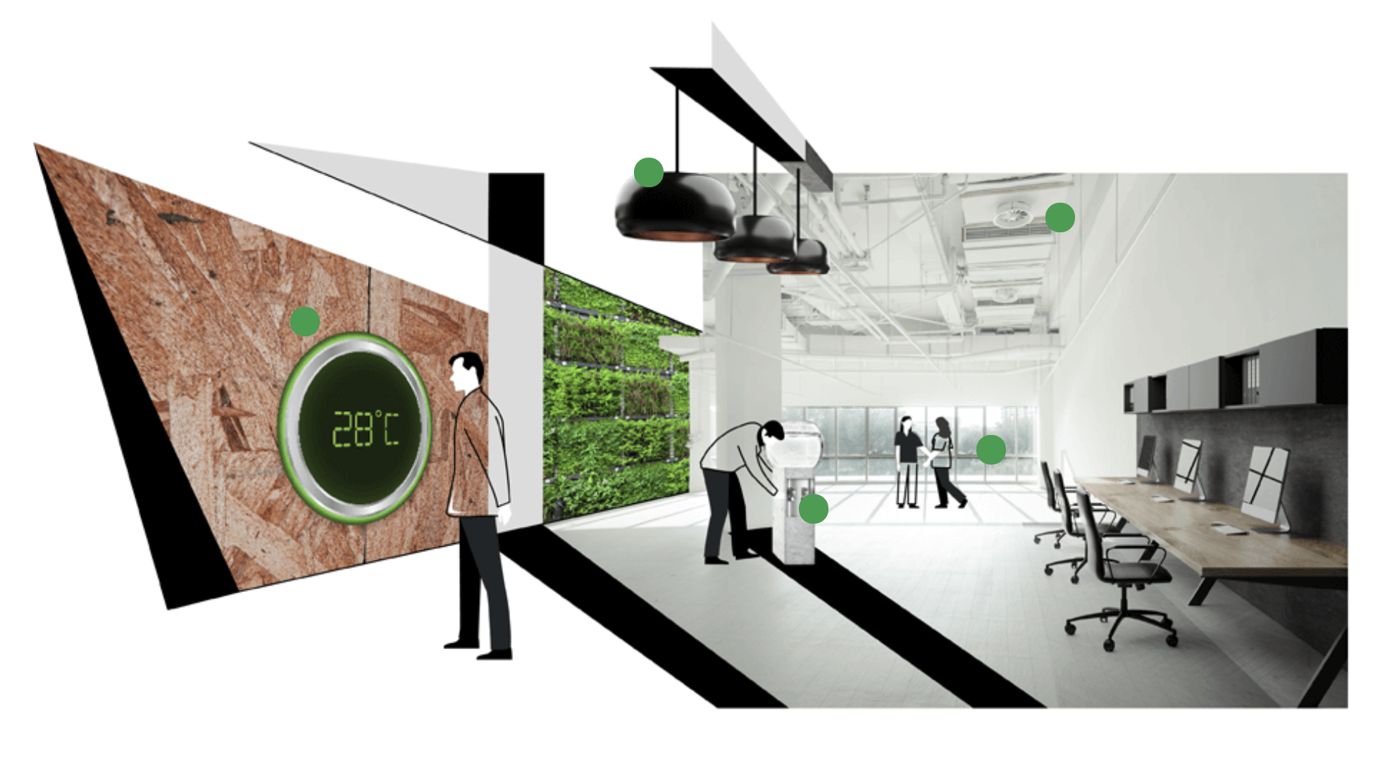
People spend roughly 87% of their time inside buildings. For offices specifically, there is lots of data generated everyday from movement, utilization, and occupancy of the people that inhabit these spaces.
Who
Anyone can enter and use a building, but there are two key user groups to keep in mind: the space occupant (the person who uses the building) and the space manager (the person who monitors and manages the building).
Why
Companies leveraging IoTtechnology and AIpredictions are able to monitor and trackdata in their building to make better informed decisions pertaining to utilization, occupancy, and energy. TRIRIGA Building Insights aims to provide a comprehensive product that delivers these insights.
the challenge --
While TRIRIGA Building Insights provides many of these insights for its users, there are lots of complications with the existing user experience of the product, including confusingnavigation, lack of actionability, and inability to display messydata (missing or skewed).
Our team began by focusing on understanding the keypainpoints by interviewing users of the existing product.
Initial interviews
We interviewed 10people across three countries (United States, Canada, Germany) with the occupation of facilitiesmanager, spaceplanner, buildingmanager, and other relevant roles with the goal of better assessing problems with the current state of the product.
Key quotes
"“I sometimes find myself manuallyexportingreports from [TBI] and importing the data into Tableau to analyze trends instead of just looking at the dashboard.”
P4, Space planner
“For immediate alerts, the product works fine, but I’m unable to really understand the data overtime.”
P2, Facilities manager
"“I have a hard time finding the data tables for some specific metrics because there isn't a specific floorlevel detail page. All the value seems hiddenaway.”
P7, Facilities manager
From our early conversations with these users, we consolidated our findings into some keylearnings:
The interface is confusing to navigate between campus and building, which can be problematic because some clients have multiple buildings across multiple countries.
The date/time picker should be globallyaccessible, not just in one component.Many of the data details modals are difficulttofind in the product.
It isn’t clear whether the data shown is displayed as peaks or averages.
Some users admitted to manually exporting reports to a .CSV file and using other software to understand the data.
User archetype
The interviews and design audit of the existing state of TBI allowed us to revise our existing user persona and create a new user archetype: The space manager.
From this set of needs, we created a list of action items to help guide our design process:
Needs:
- Segmentation of the data that lives on different buildings, floors, zones, etc.
- Clearerunderstanding and detailed information on the different KPIs that live inside his buildings
- Clarity while working around messy or incompletedata that might display anomalies due to unusual circumstances.
How might we... provide a structured and comprehensiveinformationarchitecture to help the space planner navigate to information about the campus, building, and floor?
How might we... enhance the detailviews for the data the space planner has to keep track of?
How might we... display transparency and provide control of the data so the space planner can get the insights he needs?
design direction and iterations--
With these insights in mind, we began going through iterations of how the informationarchitecture, designs, and overallproductexperience could be improved.
Sketching and ideation
For our first iteration of the new designs, we began by mapping out the information architecture, creating a content inventory, and mapped the key user flows.
Design iterations
As we continued to produce sketches and wireframes, we continuously conducted concept validation interviews and usertests throughout the process. Below is a summary of some of the pivotal insights at different stages of the process.
Iteration 1 (low-fidelity)
Tested: 5 people Method: Prototype task completion
Iteration 1 goals: 1. Validate the updated navigationstructure 2. Receive feedback on the new Building and Floorpages 3. Introduce the change from the Details modal to the new KPI data detail page
Navigation structure
Building Dashboard page
Floor Dashboard page
KPI Data Detail page
Outcomes and feedback: - The new navigation hierarchy feels easier to navigate as long as it can accommodate for different location amounts (i.e., a company with 3 buildings in one country vs. a company with 100 buildings in 4 continents) - The Peakvs.Average switcher is extremely useful and provides context on how the data is being calculated. - The globaldatefilter was received positively. - The horizontal bar charts for occupancy rate at the Building level are confusing, so the datatableview is preferable. - The different components at the Building and Floordashboard pages are insightful, but “Frequency of peaks” is not a relevant metric. - The KPI data detail page is more accessible than the previous modals, but the colors and the switching between ‘Over vs. Under capacity’ feels somewhat jarring. - The “Unusualevents” detection functionality was sometimes useful, so it would be valuable to keep that functionality in the new designs.
Iteration 2 (mid-fidelity)
Tested: 6 people Method: Wireframe reviews
Iteration 2 goals: 1. Review the updated Floor dashboard page with the floor plan and componentupdates 2. Review the updated KPI details page with colorrevisions and simplifications 3. Introduce early anomalydetection designs
Floor Dashboard page
KPI Details page
Anomaly detection indicators
Outcomes and feedback: - The horizontal bar chart for Occupancy rate is still confusing at the Floor dashboard page. - The Occupancy rate definition is helpful but takes up a lot of real estate for something that is learned over time. - The individual KPI detail pages (Occupancy rate, Frequency rate, Utilization rate, and Vacancy rate) might be better grouped into their own separate detail pages because they are notnecessarilycomparedwitheachother. - There is a desire to be able to better understand data for space (meeting room, desk/workpoint, etc) entity types. - The anomaly detection indicators are helpful but the horizontal markers are visuallyoverwhelming. There needs to be moreexplicitcontext to show how the anomalies are being detected.
Iteration 3 (mid to high-fidelity)
Tested: 6 people Method: Wireframe reviews
Iteration 3 goals: 1. Review revised Floordashboard with simplified components and color scheme 2. Introduce new space-specific details page 3. Review updates to anomalydetection treatment in detail views
Floor Dashboard page
Spaces (Workpoints) Details page
Anomaly detection indicators
Outcomes and feedback: - The monochromaticcolorscheme would be difficult to read when the floor plan is white. - The individual KPI detail pages are preferred, but it would be helpful to have filtering and comparisonfunctionality for different entity types in each KPI. For example, comparing the Occupancy rate of the Sales organization against the Research organization on a given floor. - Some clients have two different IoT implementations in their buildings: sensors and CiscoDNAspaces. It would be helpful to have a product that encompasses both data sources. - The anomaly detection should ideally include more details about the upper and lowerbounds of what values were expected. The average point of each anomalous range would also help add clarifying context on how the data was normalized.
the design system --
While IBM's Carbon Design System supports a widearrayofcomponents that fit many use cases for various software products, there were a fewuniquecomponents within TBI'sdesignsystem that were custom created for the specific needs of the Space manager.
Additional components were needed to support: A) Various dashboard cards that accommodated for different types of information, including: chartpreviews, breakdowns, continuous vs. discretedata, and segmentedinformation. B) ExplainabilityofAI-related concepts and instances - Delineation of incomplete, or anomalous data C) Viewing and understanding spaces visually on a floor plan
D) Hierarchy-specific navigation Robust filtering (peak vs. average values, data source selectors, etc).
A) Dashboard cards
B) Anomaly detection components
C) Floor plan component
Full TBI design system
solution --
To bring back the initialneeds of our Spacemanager...
How might we... provide a structured and comprehensiveinformationarchitecture to help the space planner navigate to information about the campus, building, and floor?
How might we... enhance the detailviews for the data the space planner has to keep track of?
How might we... display transparency and provide control of the data so the space planner can get the insights he needs?
features and functionality--
How might we... provide a structured and comprehensiveinformationarchitecture to help the space planner navigate to information about the campus, building, and floor?
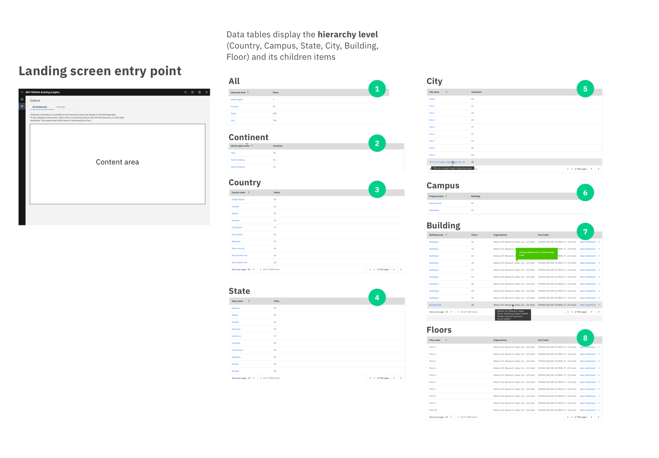
Information architecture that supports navigating from the country to building to floor to space.
All of the buildings in the Space manager's portfolio are sorted by location: from Continent to Country to State to Campus to Building.
Within each building, they are also able to access specific floors, workpoints, and spaces within that building.
How might we... enhance the detailviews for the data the space planner has to keep track of?
Individual dashboards for each building, floor, and space.
Individual detail views for Occupancy rate, Frequency rate, Occupancy count at all location hierarchy levels. Comparisonfunctionality within each detail view.
How might we... display transparency and provide control of the data so the space planner can get the insights he needs?