Munich Exploratorium Dashboard

A new monitoring dashboard that displays interaction data for the Exploratorium exhibit from the high-level to the granular.
team & role --
UX Designer and Researcher
Primary research, research plan, usability testing, revised information architecture, low-fidelity to hi-fidelity wireframes

Gabriel De Carvalho Souza (Front-end developer), Abigail Wise (Data science), Pedro Spadacini (Back-end developer)
context--
8 weeks, 2020

This project was created out of a 2 month-long IBM residency program at the Watson IoT Headquarters Center in Munich, Germany. Our team was given a brief and light supervision to create a working solution by the end of the residency.
background --
The Munich Watson Center is the HQ of IBM’s Internet of Things division. Every month, several interested visitors visit the center’s Client Experience Center, where they’re able to interact with different exhibits that showcase the potential of Internet of Things.
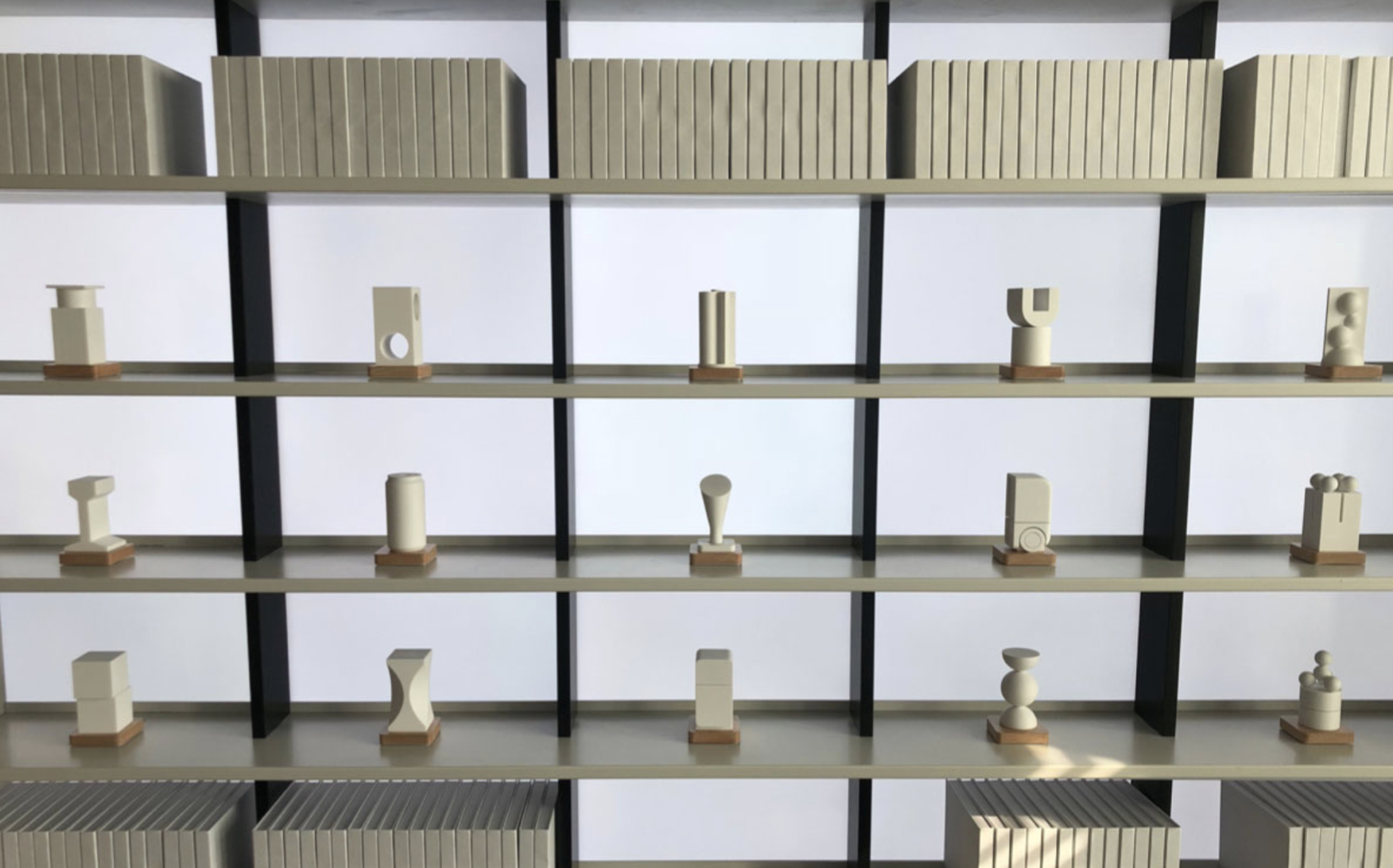
The Exploratorium, one of the key exhibits in the visitor experience, is comprised of twelve small objects on a shelf. When a visitor picks up an object from its spot on the shelf, a video “story” plays in the background explaining the case study that the object is associated with. Visitors can choose to place objects back in their original positions or move them to different spots.
Picking up an object from its shelf spot plays its respective "story" video.
One of the Exploratorium shelves, with each shelf spot filed with an object.
the challenge --
You can think of this challenge similar to that of a fictitious IoT-enabled grocery store.

Let’s imagine that this grocery store has a fixed set of rows and columns, with each spot on the shelf intelligent enough to understand which item was put down, where it was placed, and how long it was held for.
While this may not be the most interesting data by itself, there can be potential trends and insights that can be surfaced upon analyzing and sorting the historical data in new ways.

For those in charge of monitoring the Exploratorium, it can be a challenge to understand the vast amount of data (pick-up events, hold time, position, etc) coming in from the exhibit.
For example -- what if someone wanted to understand why “object A” was being picked up more frequently than “object B”?

Is “object A” simply placed on a more accessible spot on the shelf? Or is “object A” visually more interesting to visitors?
The existing monitoring experience was a simple application showing the total interaction counts of each object. makes it difficult to elicit unique insights for those reviewing the interaction data.
How might we create a new monitoring experience that interprets interaction data from the Exploratorium in ways that gives us new insights about the placement of stories and objects?
key needs --
Throughout the duration of our research process, we had conducted a few interviews with the users who would actually be monitoring the Exploratorium and giving tours. The insights and needs we identified from our interview participants played a crucial role in how we designed our solution.
solution --
A new monitoring dashboard that displays sortable interaction data for the Exploratorium from the 10,000 ft overview (the tower) to the most granular drill-down level (individual object).
Tower and Room data
Throughout any point of the navigation hierarchy, the breadcrumbs at the top left of the page display where exactly the user is (i.e., Tower 1 > Room CE 1 > Shelf 1 > Coca Cola Object).

To start, users can navigate from the Tower level to the Room level. The Tower page displays the status of each room in the towers.

The Room page is comprised of two tabs: Stories data and Shelf data.
The Stories tab displays aggregate interaction counts of all of the objects in that room, along with a ranked table ordered by object popularity.

The Shelf tab shows a visual representation of each shelf and a heatmap of shelf position placement. The heatmap allows the user to better understand which shelf spots are more or less popular in that room.
Individual object data
From the Room level, the user can drill into the individual Object level to view data specific to that object in that room.
The placement heatmap at this level shows which position that specific object was placed the most frequently. If there is a desire to understand how that compares to the overall shelf's position distribution, the toggle switch can be turned on to overlay the shelf's position information onto that individual object.
This functionality allows those monitoring to identify discrepancies and assumptions about an object's performance -- if it's being picked up frequently due to the way it looks or where it usually is placed, etc.
Surfacing additional trends
Along with viewing the hierarchical information, the Overall Trends page shows a more aggregate view of all of the different rooms and objects. All information can be sorted and filtered at the top of the page by the time range, the room, and the size and industry of the tour group.

The filters allow those looking for trends to potentially surface different insights from the data based on less obvious factors. For example, a tour group from the Automobile industry might naturally have more interest in story objects that look like cars.
The Story Trends tab shows an ordered ranking of all of the different objects. This ranking can be sorted by the most to least interactions, the hold time, or alphanumeric.
The capabilities of this dashboard came directly from the research and insights we got from assessing the existing state and talking to the users that monitored the Exploratorium.
process --
This project spanned two months and consisted of an understanding, concept direction, iteration, and development phase.
existing state--
To kick off our understanding of the space and the project, we began by interviewing our users, looking at the existing state, and affinitizing our insights.
Interviews
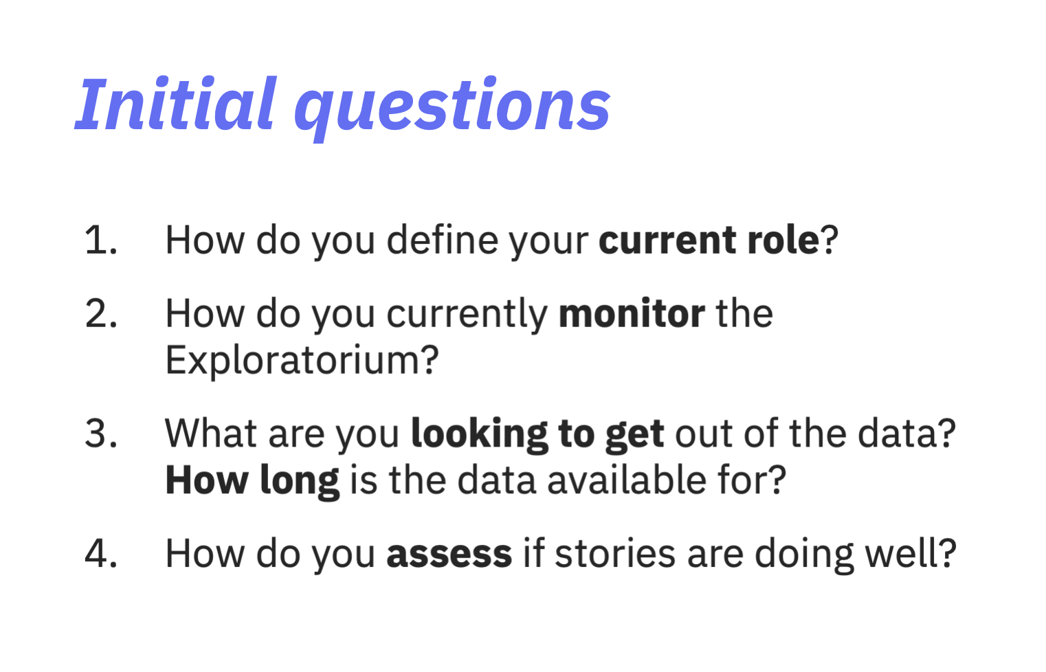
We began by fleshing out some general goals of what we were trying to understand about the Exploratorium, the process of monitoring data, and giving tours. From there, we came up with a research plan that outlined a few general questions to ask our four interview participants.
Existing state
From there, we came up with a list of a few key insights that helped provide additional context to our brainstorming:
While there was an existing monitoring dashboard for the Exploratorium, there were a few information architecture-related problems. To better understand the exact issues, we mapped out the sitemap and outlined some general opportunities for improvement.
Key needs
At this stage, we were able to define the key needs we were looking to solve in our solution. These needs directly informed our brainstorming and concepting process.
Data audit
Along with the UI of the existing state, we also observed the actual JSON data that the current monitoring dashboard was receiving from the Exploratorium events.

The JSON object for each type of interaction was rather simple, with three main bits of information for every pick-up or put-down event: the device information (type and ID), the interaction information (the RFID tag for that object's interaction, the position row/column, and which story it was), and the timestamp.

In addition to the interaction events, the Exploratorium also sent a "heartbeat" every 30 seconds to ensure that the shelf was online.

This information was profoundly important because it allowed us to imagine the possible data trends we might be able to surface in the new dashboard.
Brainstorming
Once we had conducted our interviews and observed the existing state, we began to map our thoughts, ideas, and areas that could improve the experience on a board.
concept development--
At this point, we began to take more actionable steps towards developing our concept with these insights in mind.
Data exploration
Since we did have access to live interaction data from the Exploratorium throughout the duration of this project, we were able to tinker and experiment in programs like Minitab and Excel with different data comparisons and visualizations to see if any meaningful insights could surface as trends.
This was an extremely enriching part of the project, as it allowed us to correct our assumptions about what data trends might be interesting or make sense.
Information architecture
Once we had a better grasp on the desired functionality, data inputs, and insights from our sponsor users, we began brainstorming how we could re-architect the content of the dashboard.
Wireframing and user testing
From our brainstorming, we consolidated our ideas into two basic approaches or versions of our idea. I was responsible for creating wireframes and prototypes from these versions to take into user testing.
To ensure that our users’ voices were heard throughout our iteration process, we ran two rounds of user tests with the same participants we interviewed.

For our first round, the primary goals were to test our different versions and approaches we had created at a low-fidelity.

For our second round, we were looking for more detailed feedback on a slightly more developed version of what had tested well previously, along with some navigational hierarchy feedback at a mid-fidelity.